Creating a luxury brand for a luxurious honey.
Challenge
As Honey Australia continues to grow across global markets, the shelf gets noisier and the expectations get higher. Premium honey is no longer a niche; it’s a competitive category filled with bold claims, busy packs and brands fighting for attention.
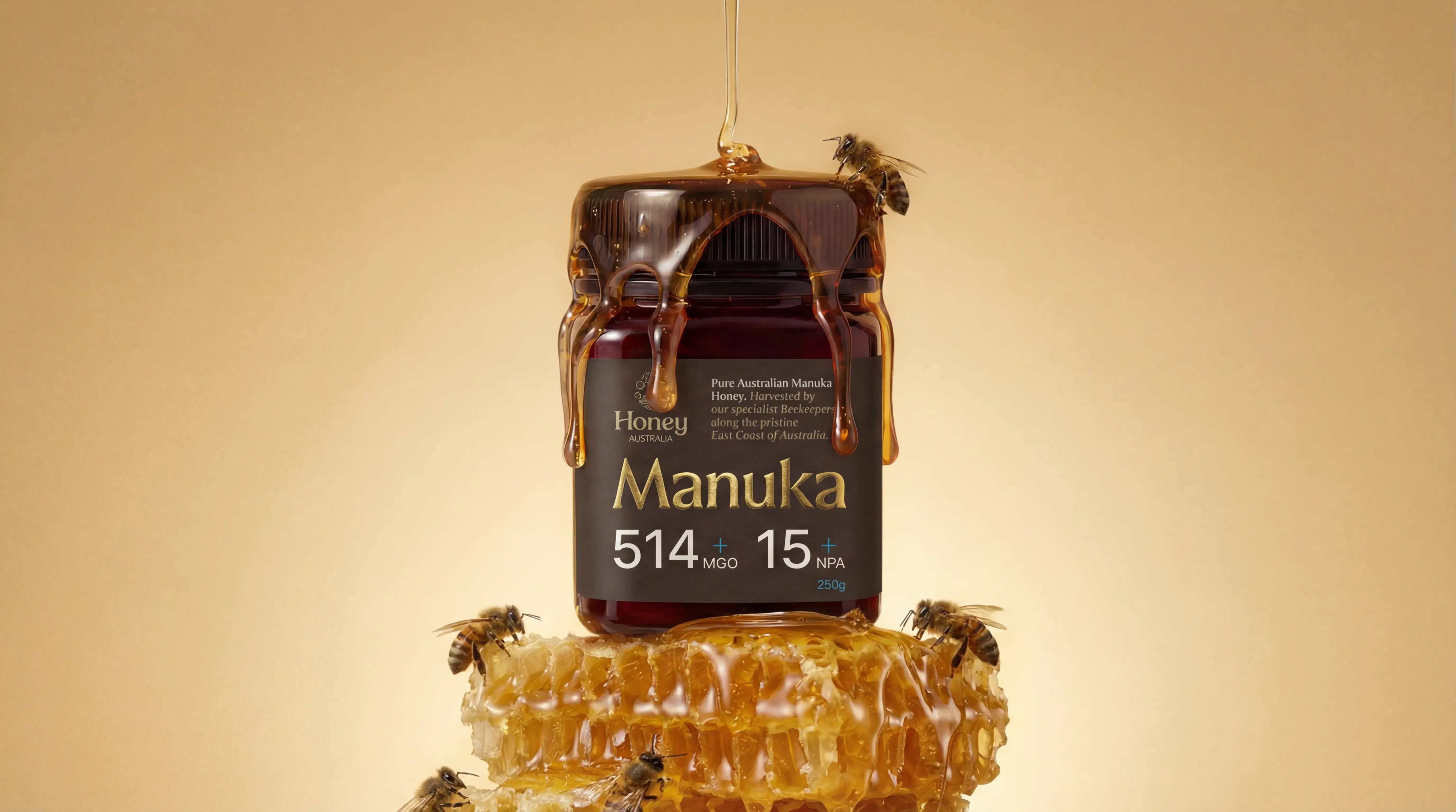
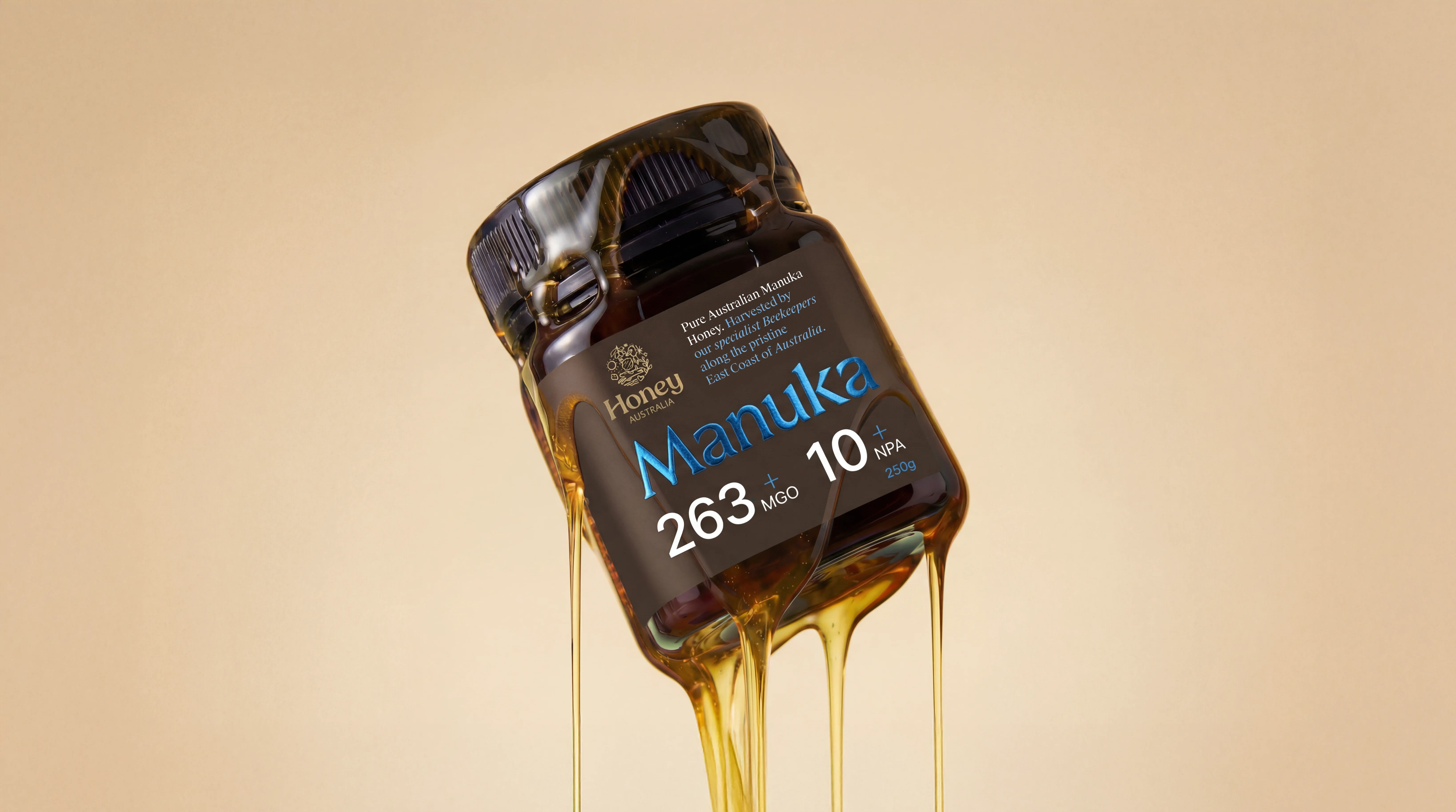
We were tasked with reimagining Honey Australia’s Manuka range to feel unmistakably premium and globally competitive. Packaging that commands attention, communicates quality at a glance and elevates the product into gift-worthy territory without losing clarity or trust.
Solution
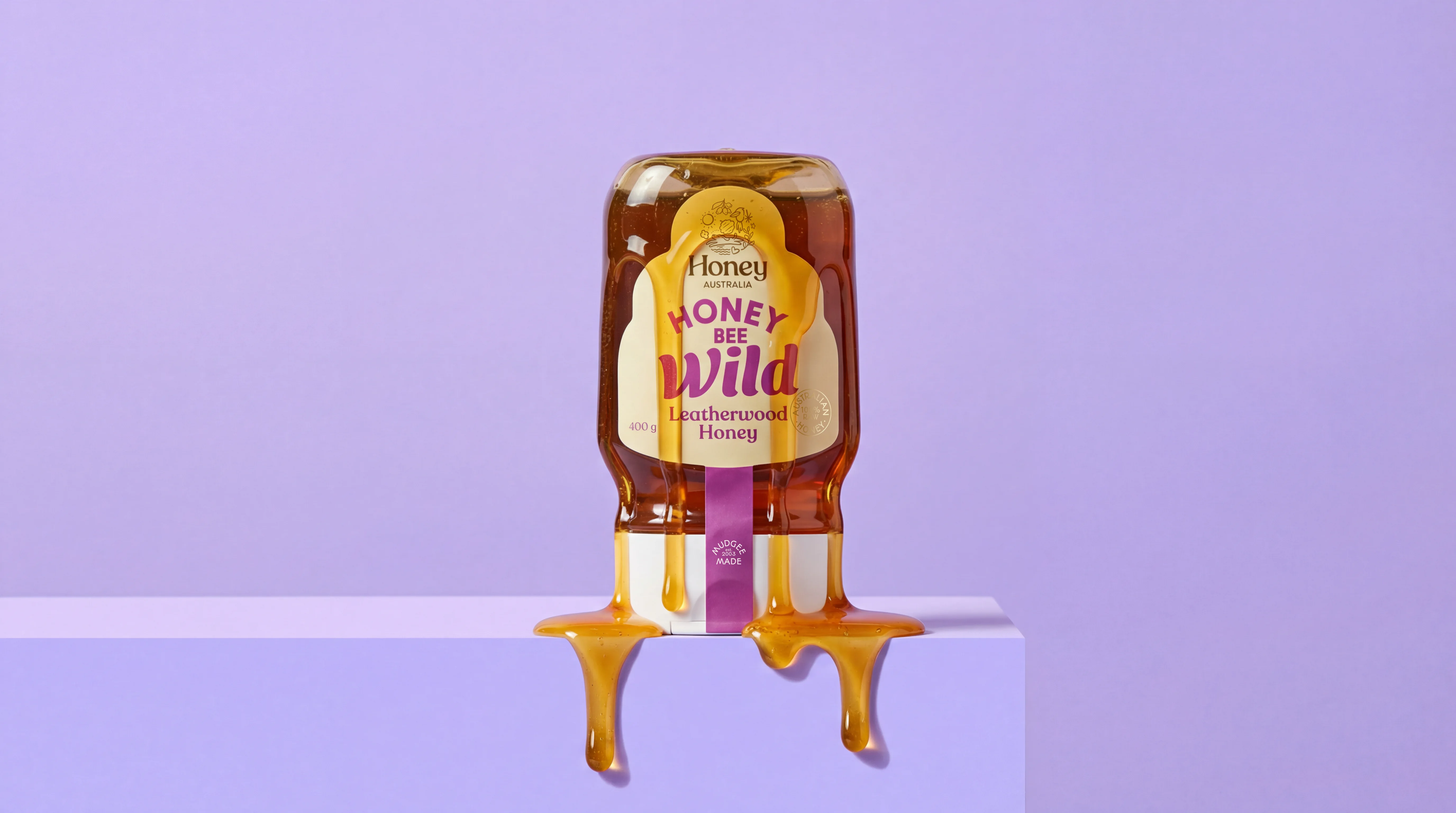
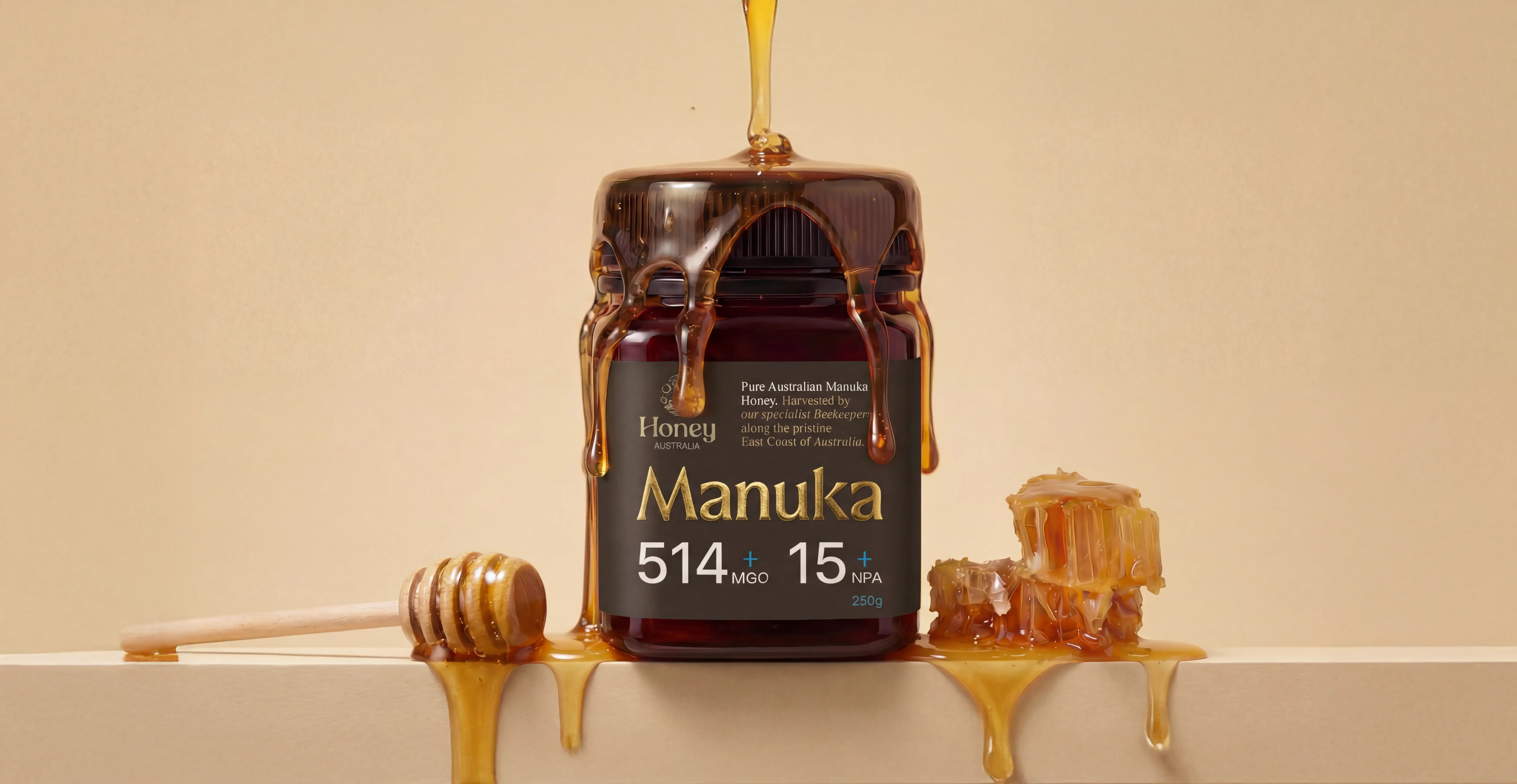
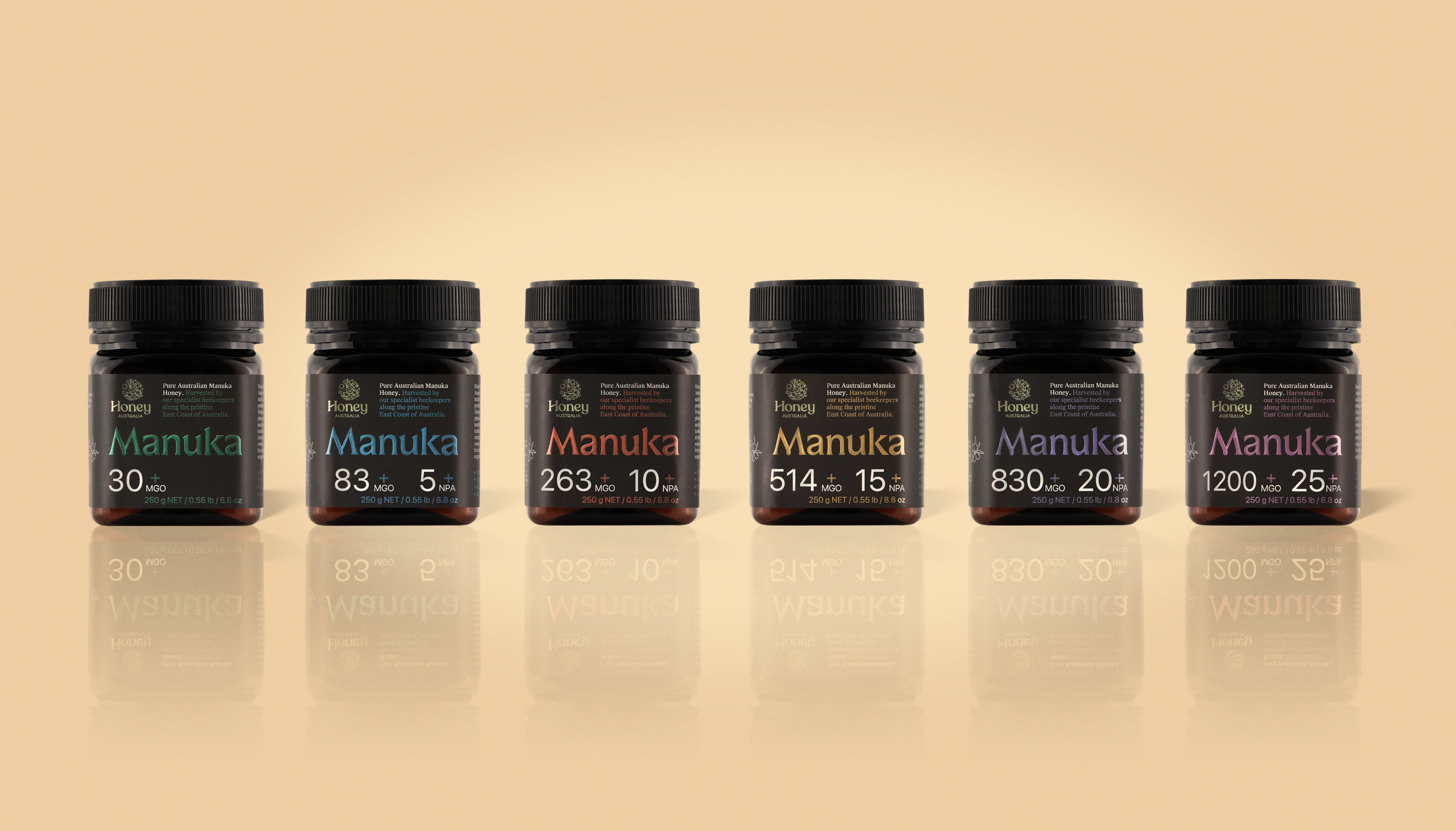
We designed a packaging system that is both functional and beautiful, built to stand out in-store and scale effortlessly across the range.
From a brand recognition point of view, the design quickly establishes the essentials: the Honey Australia brand, the Manuka variant and key product information, presented with clarity and confidence. The visual language balances restraint and richness, creating a luxury feel that matches the product’s provenance and price point.
The result is a refined, premium pack that feels at home on the world stage and makes the quality of the honey evident before the jar is even opened.