Bringing the buzz of life to the supermarket shelves.
Challenge
With the new brand platform in place, our next task was to bring the playful spirit of “Enjoy the Buzz of Life” to Honey Australia’s everyday range. The goal wasn’t just to make the packs look nicer, it was to build an everyday system that felt unmistakably Honey Australia: optimistic, energetic and full of life, while still being easy to shop and scalable across multiple products.
The everyday honey aisle is also notoriously hard to win in. It’s flooded with “same-same” design, rustic cues, predictable claims, with brands all communicating in near-identical visual and verbal language. Standing out without losing clarity was the challenge.
Solution
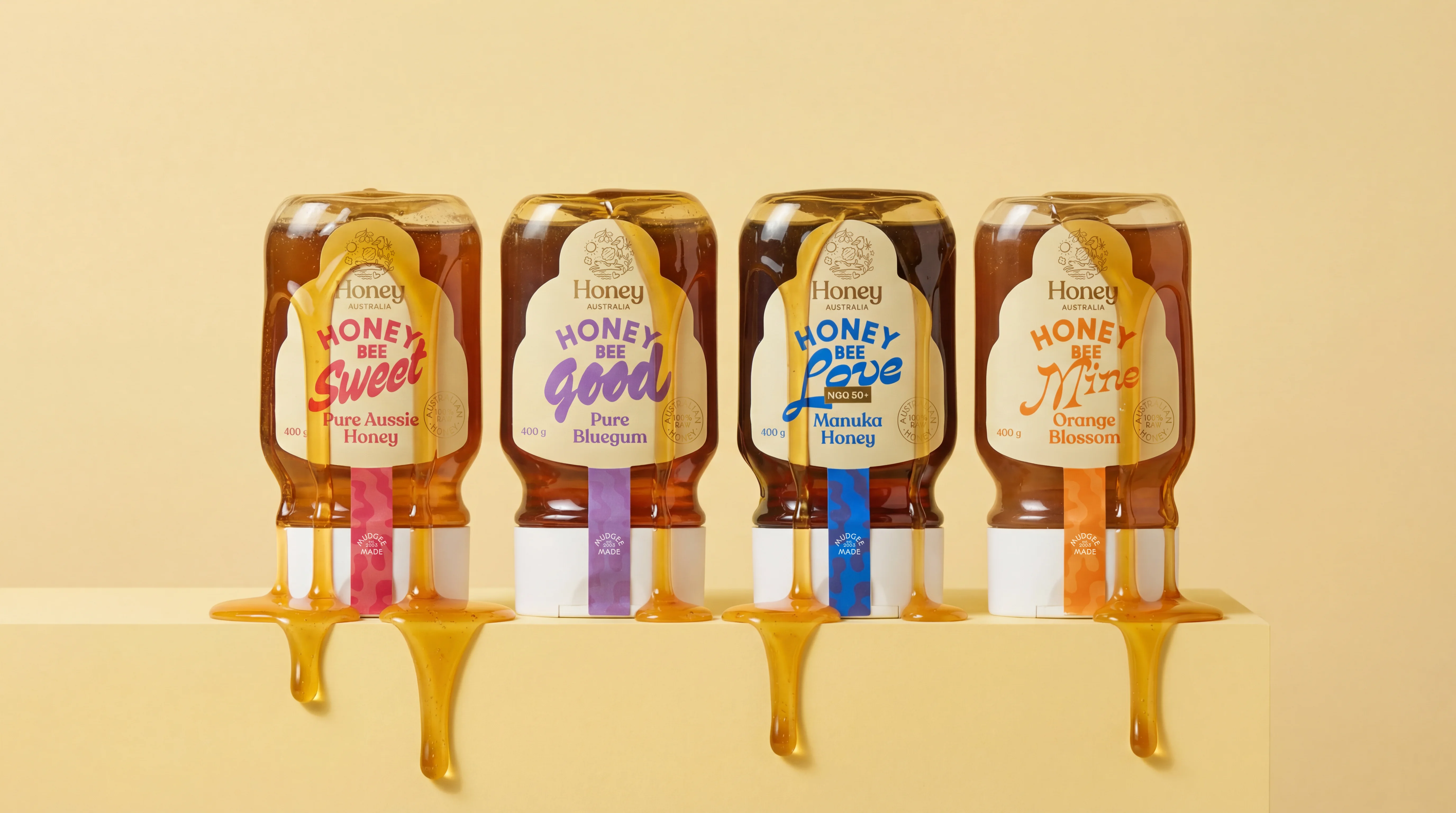
We chose to differentiate with language first.
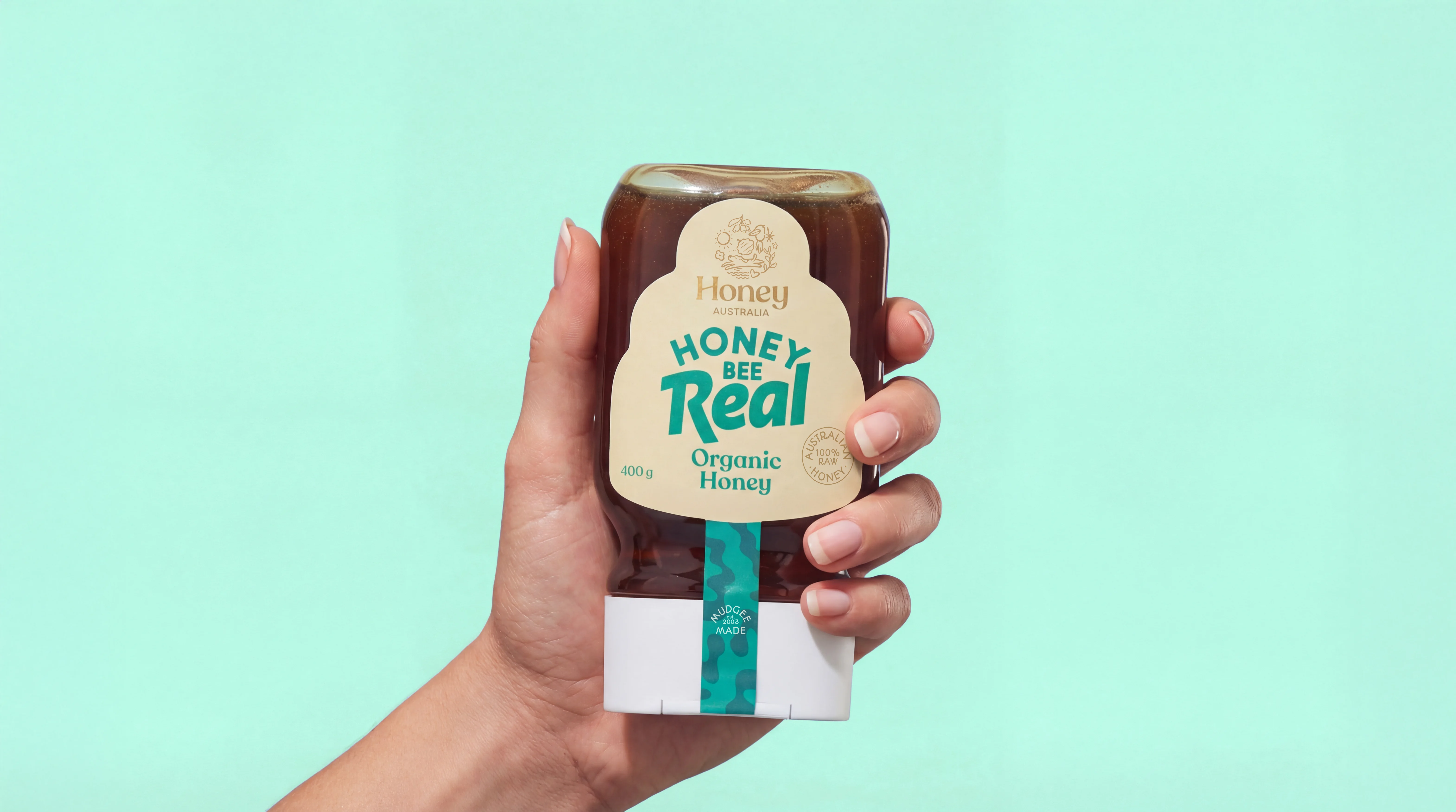
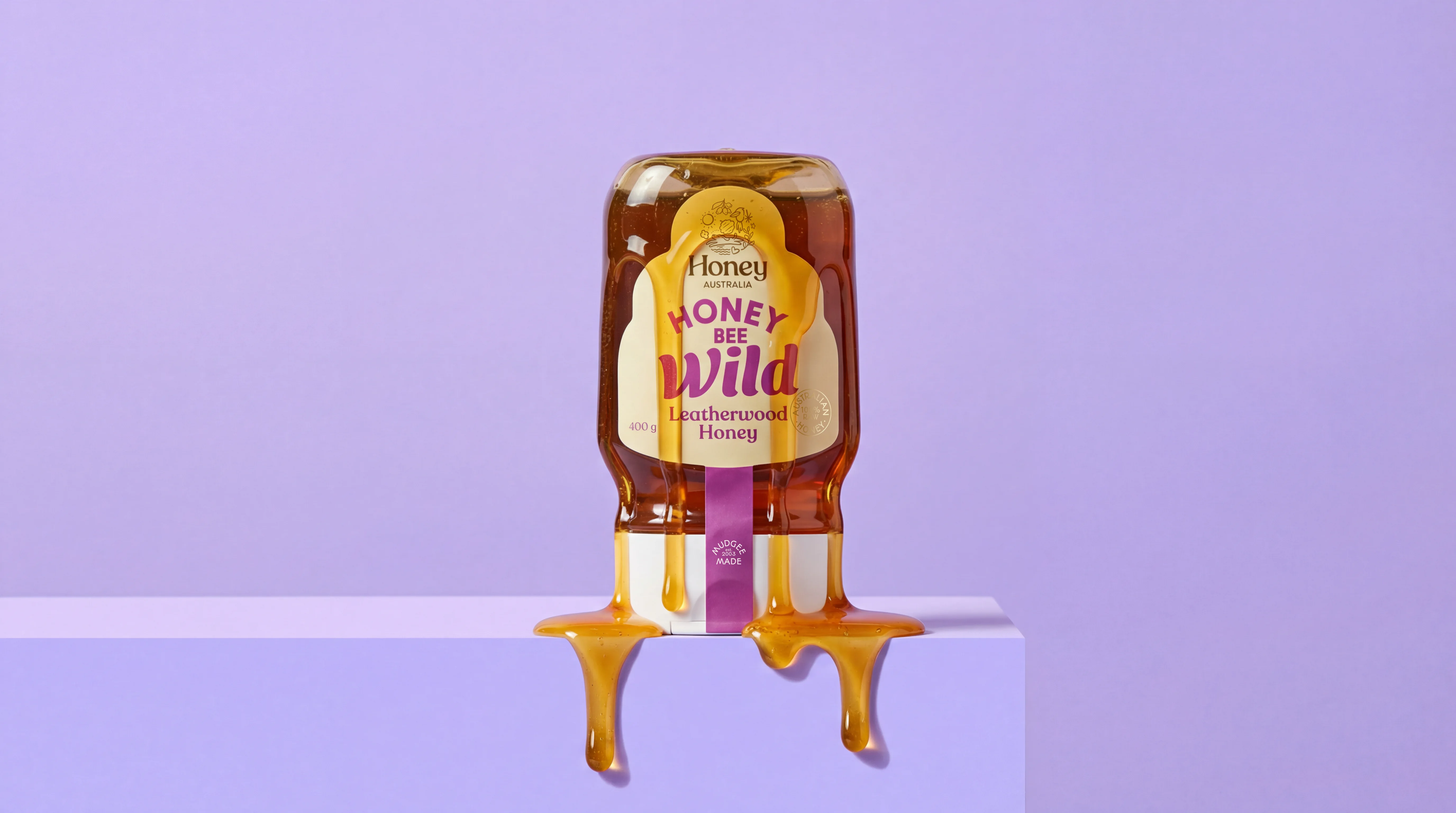
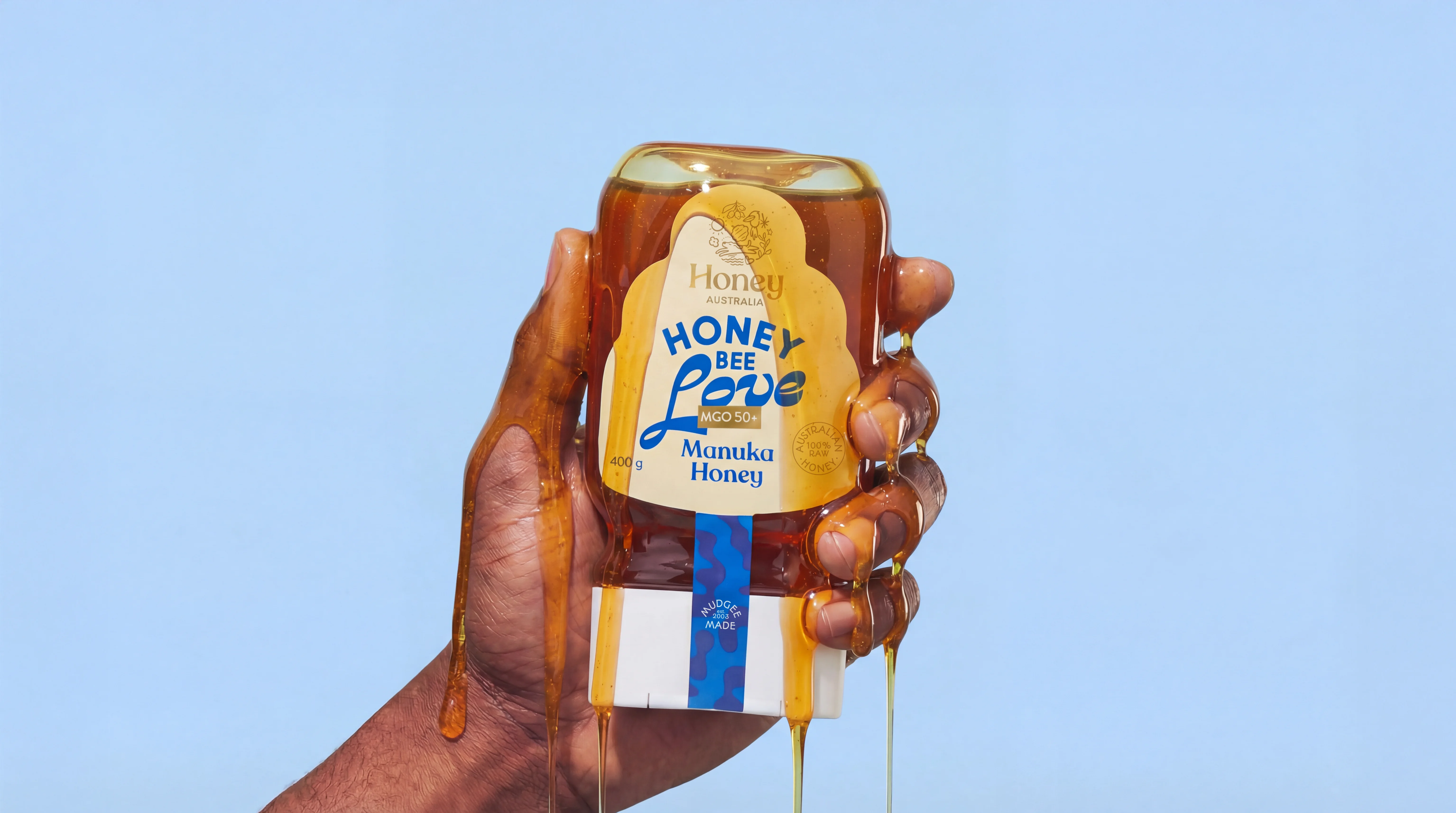
Instead of following category conventions, we introduced a new naming protocol: Honey Bee, a simple, ownable idea that created instant recognition across the range and opened the door to more personality.
From there, each product name became an opportunity to inject meaning and emotion into an everyday purchase: Honey Bee Wild, Honey Bee Love, Honey Bee Life. These names shift the experience from purely functional to something more human.
Visually, we leaned into expressive typography to amplify the playful spirit of the platform. Bold type became a hero element, bringing energy, movement and attitude to the pack while keeping the hierarchy clear and shop-friendly. The result is a range that feels bright, modern and memorable.