Designing the ever-expanding Mayver’s range
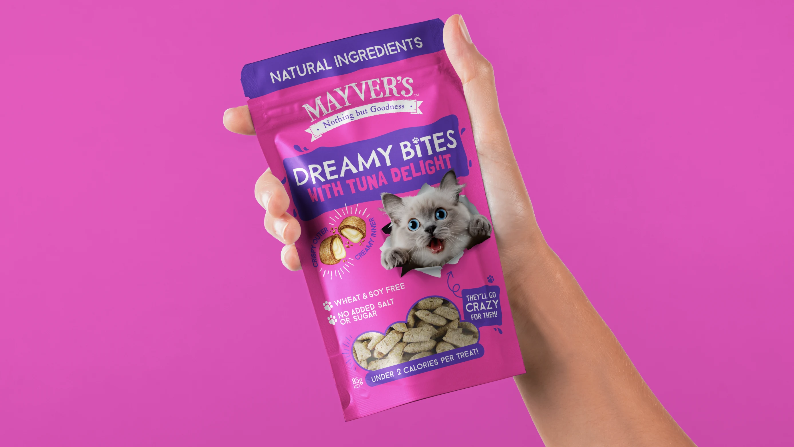
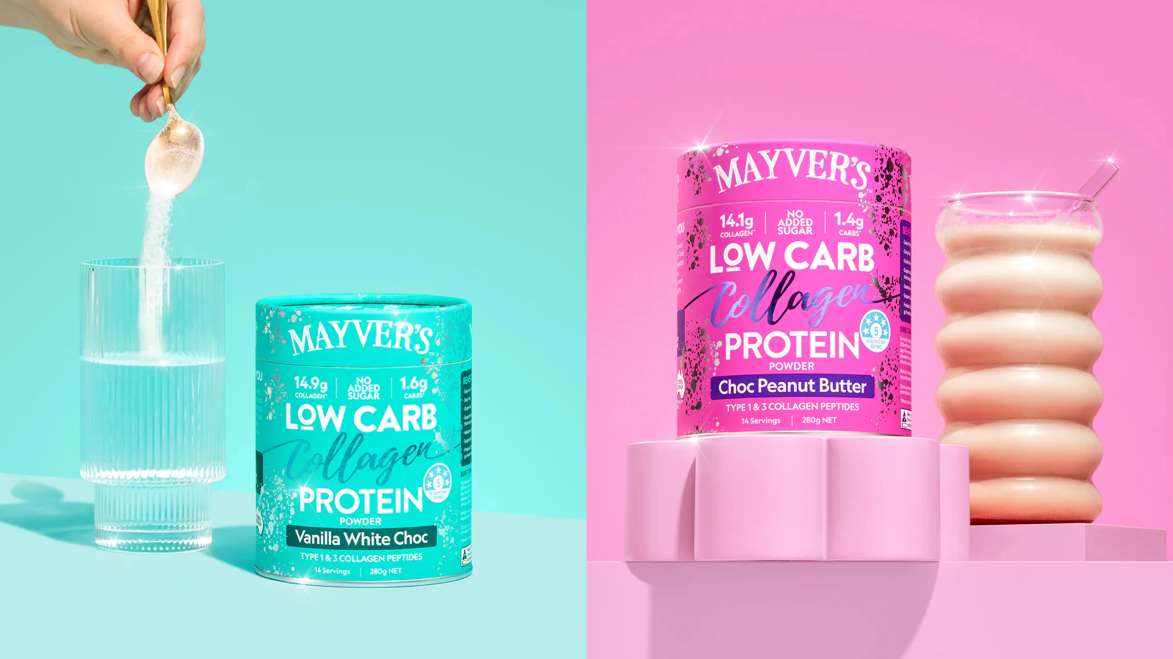
Mayver’s doesn’t stand still. They’re constantly evolving, trialling and launching new products . That pace of innovation has taken them far beyond peanut butter. What started in one aisle now spans multiple parts of the supermarket: spreads, health bars, nutritional powders and even pet treats.
Our challenge has been to help that growth happen without the brand losing shape. Every new product needed to feel unmistakably Mayver’s, while still being tailored to a new shopper mindset and new purchase occasions. On shelf, the work had to do three jobs at once: earn attention, communicate fast, and build trust.
Solution
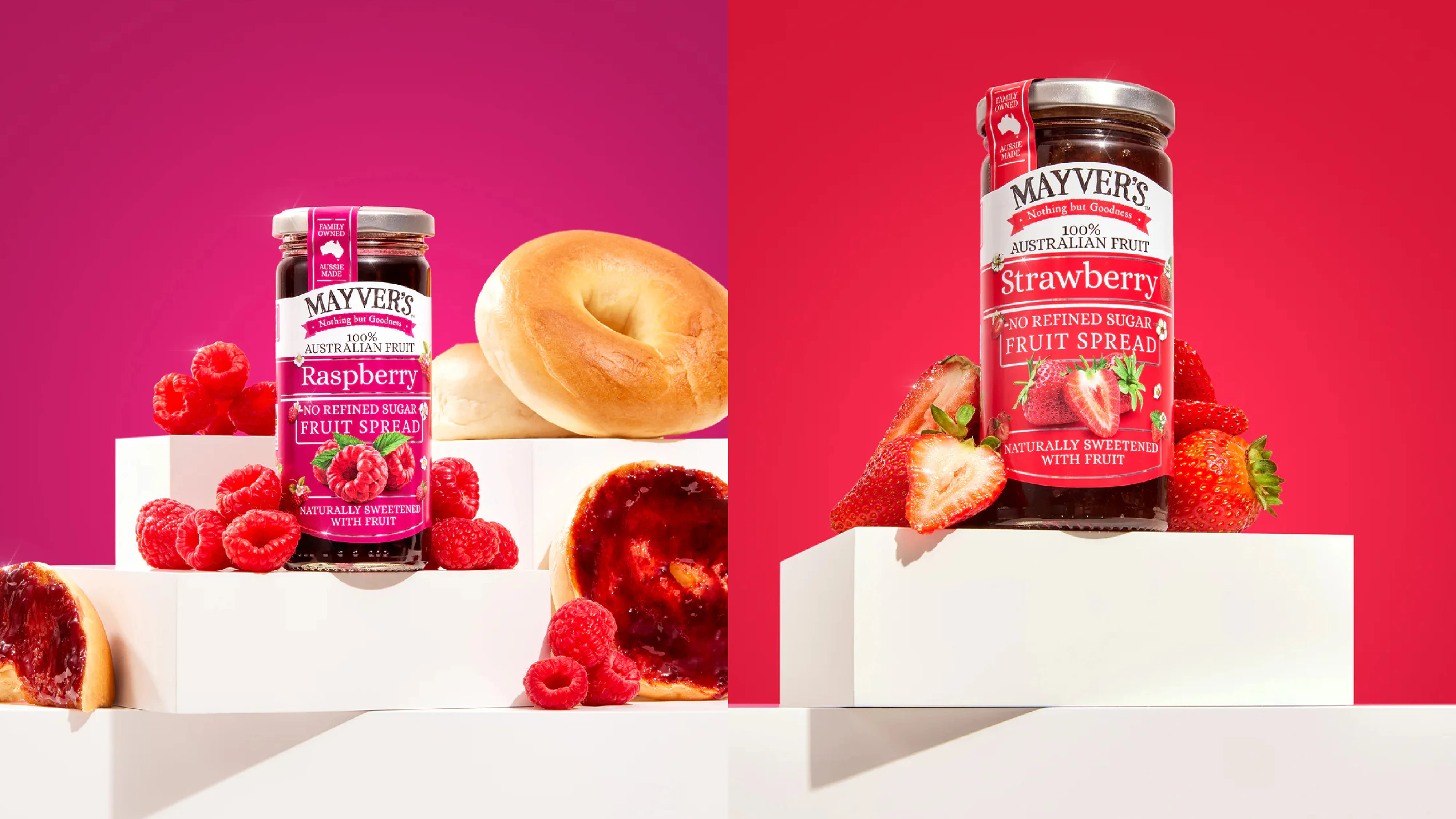
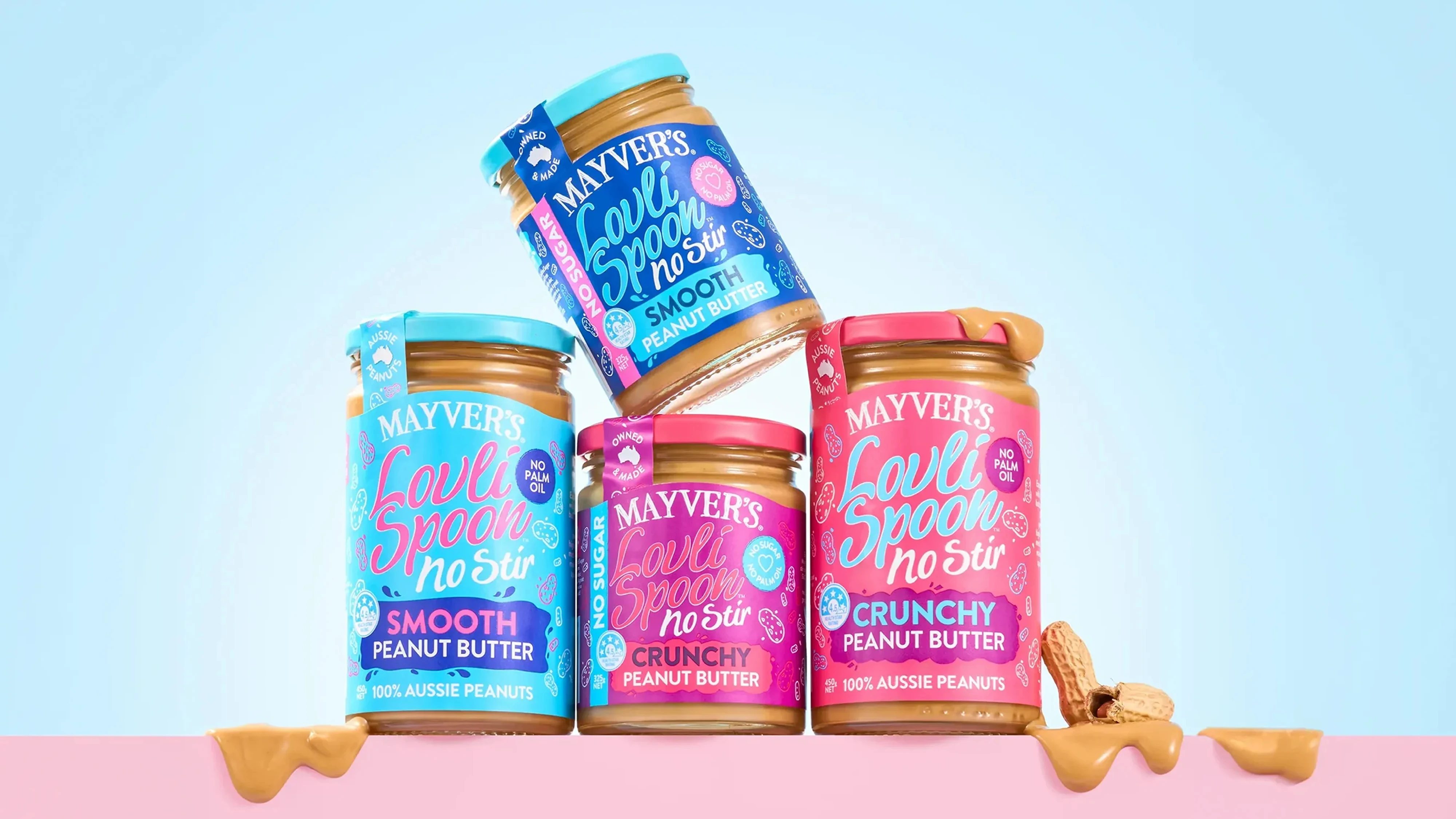
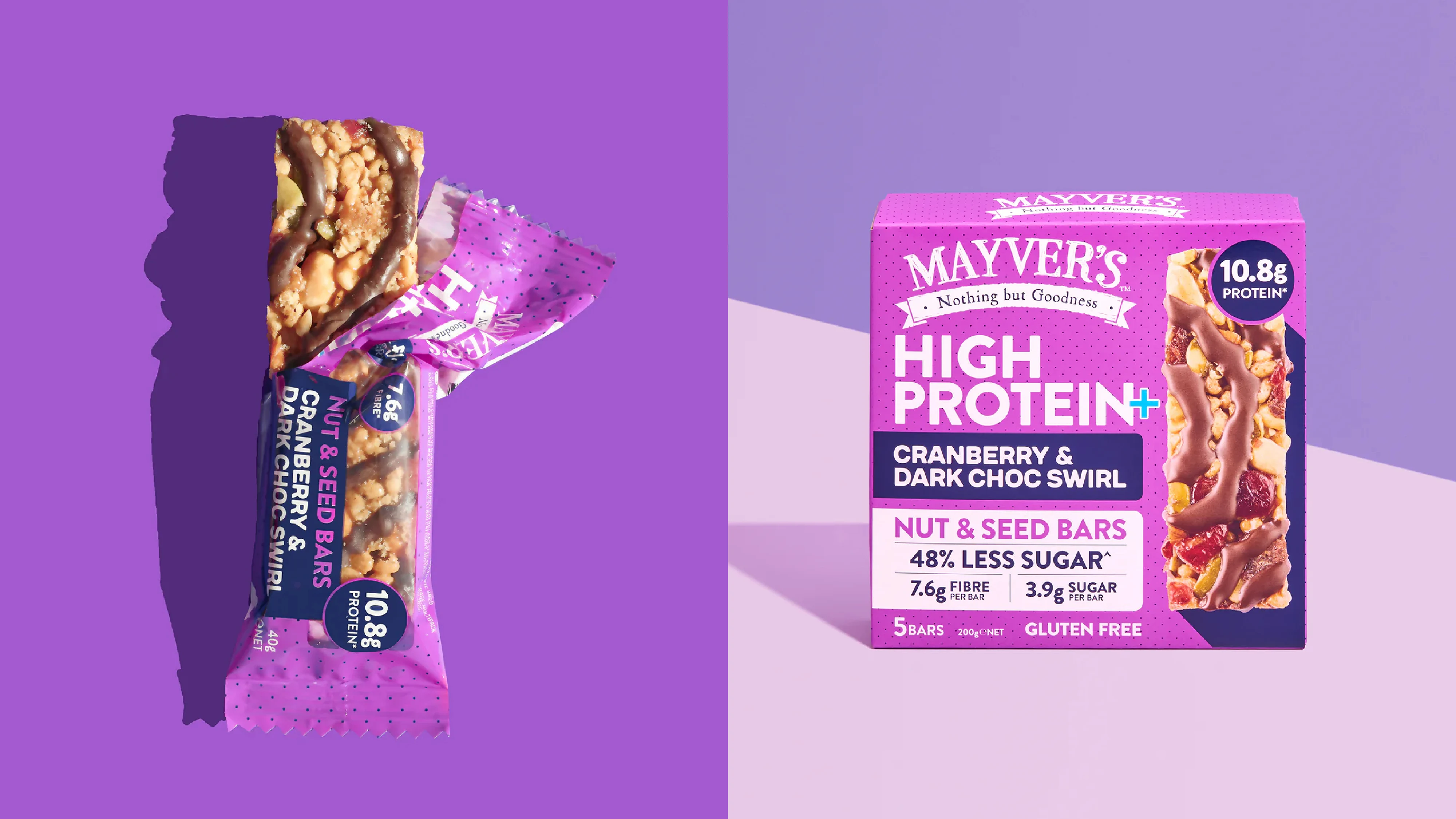
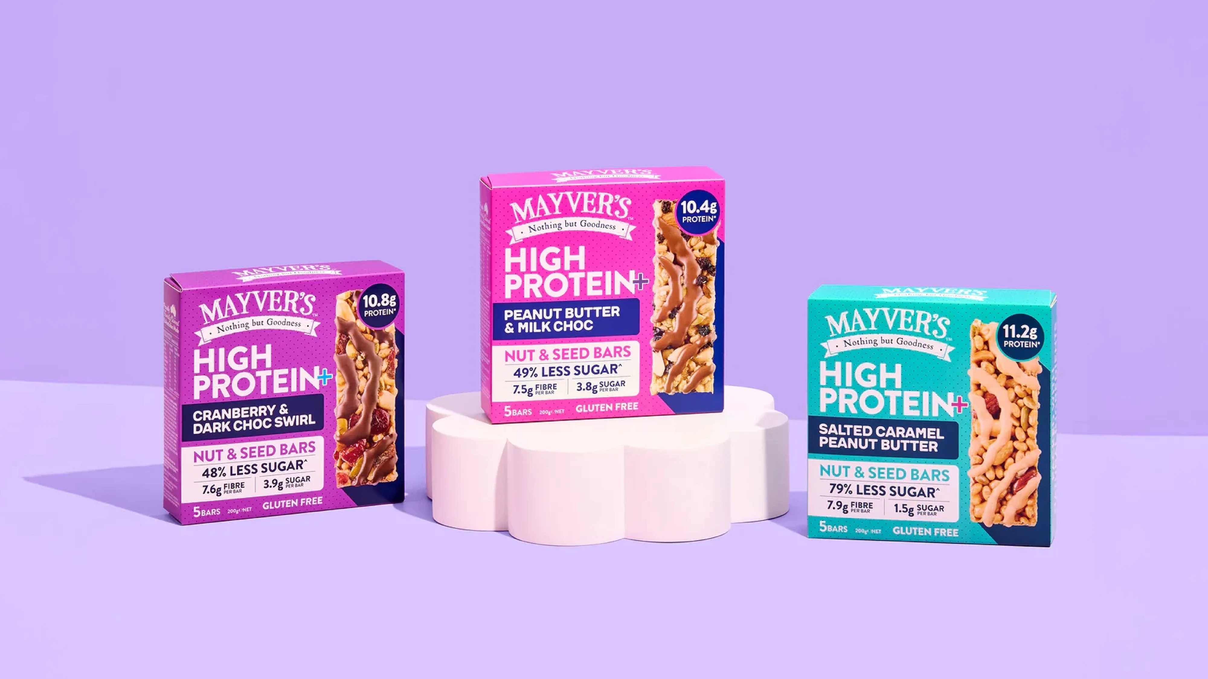
For every new product, we start with the same principle: own the moment on shelf. That means designing in a way that creates clear distance from the category landscape, not by being louder for the sake of it, but by being more confident, more recognisable and easier to shop.
Bright colour, bold design language and strong hierarchy are always front of mind, paired with clear range signalling so customers can find what they want quickly and understand the differences between products at a glance. As the range expands into new categories, we adapt the system without breaking it: keeping the core brand cues consistent while allowing enough flexibility for each product to feel purposeful in its category.
The result is a growing body of work that keeps Mayver’s looking modern and cohesive, while continuing to win attention, build preference and take share from competitors that have been established for far longer.