A brand shift from sweet to savoury.
Challenge
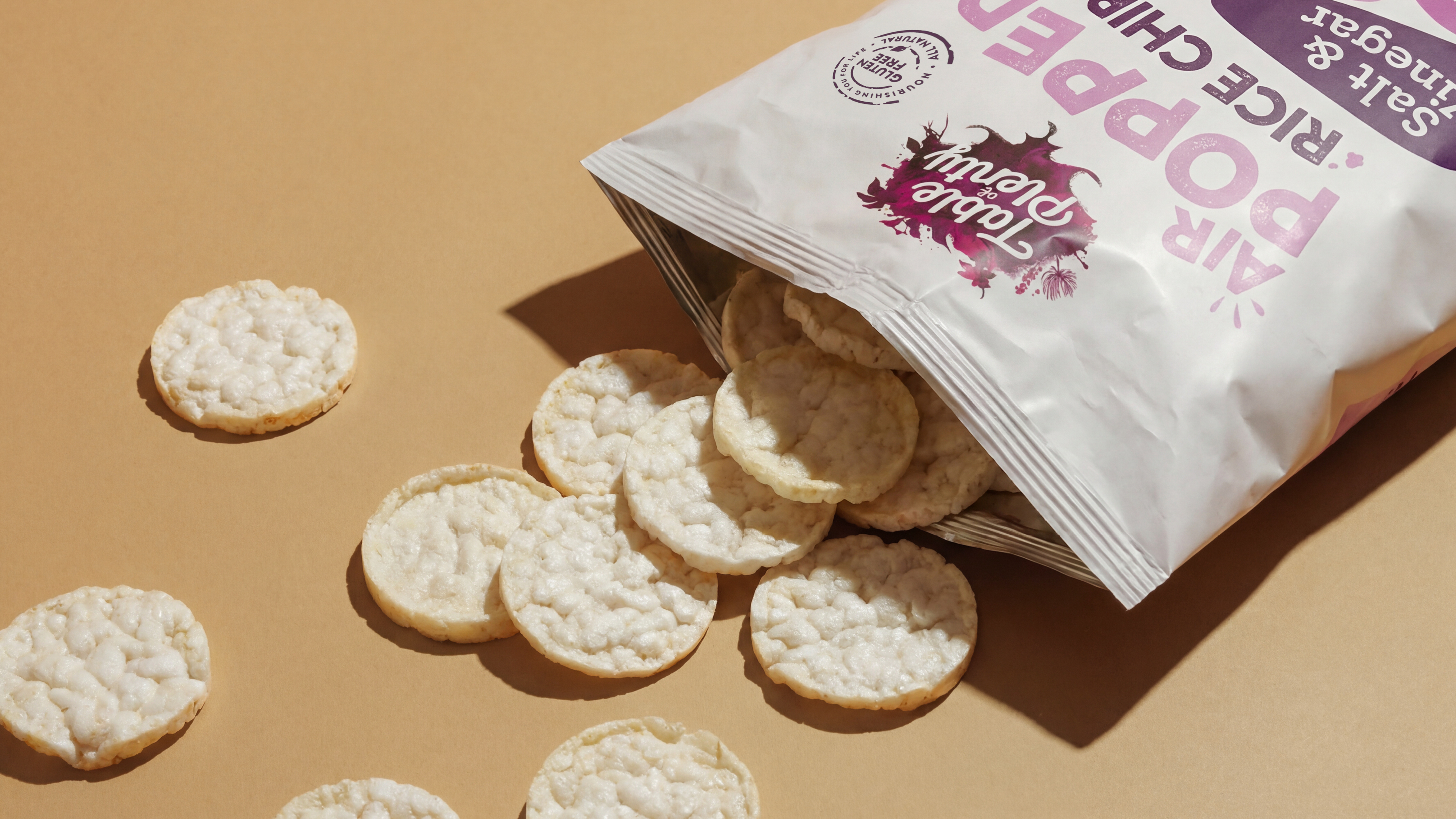
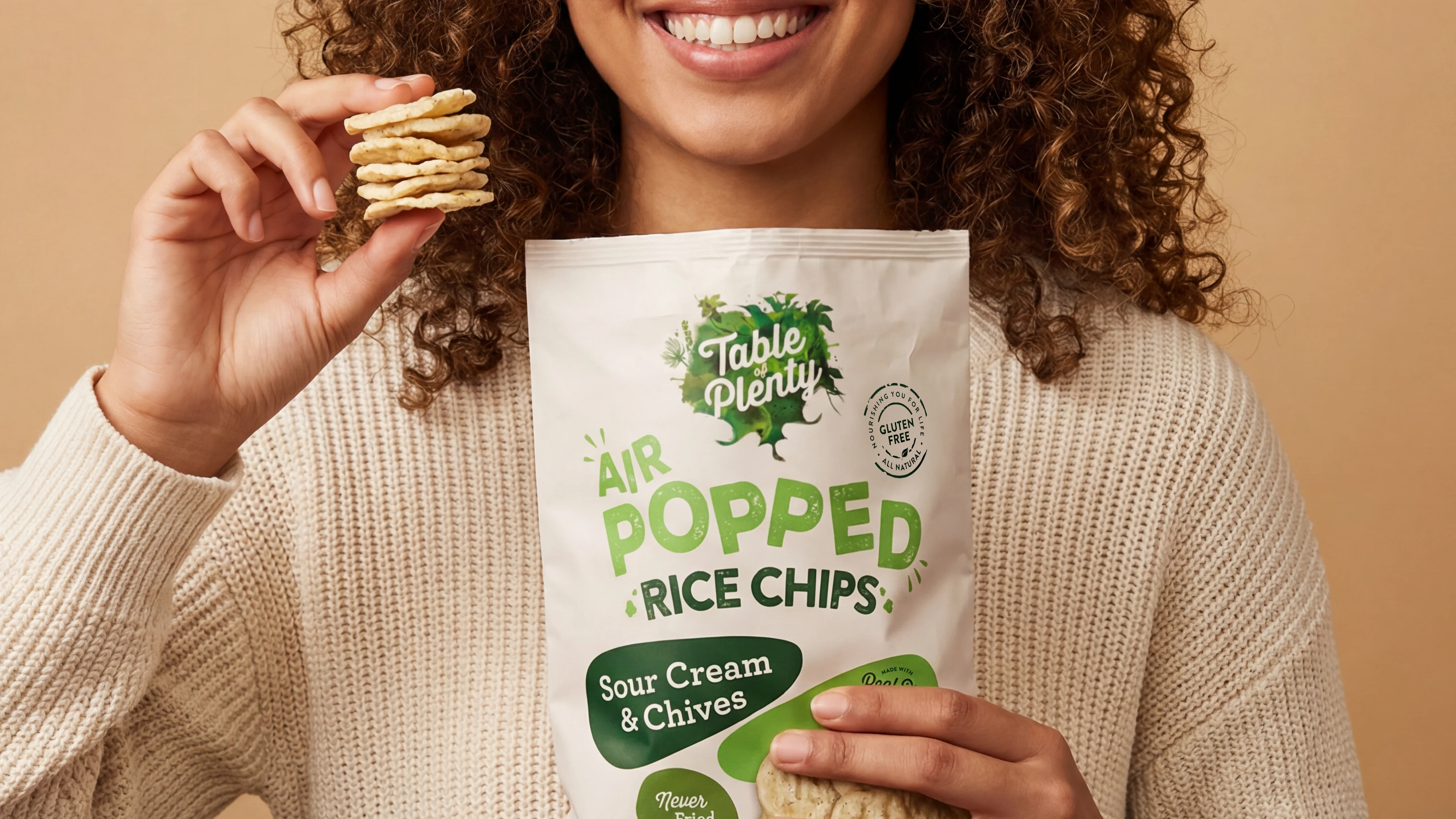
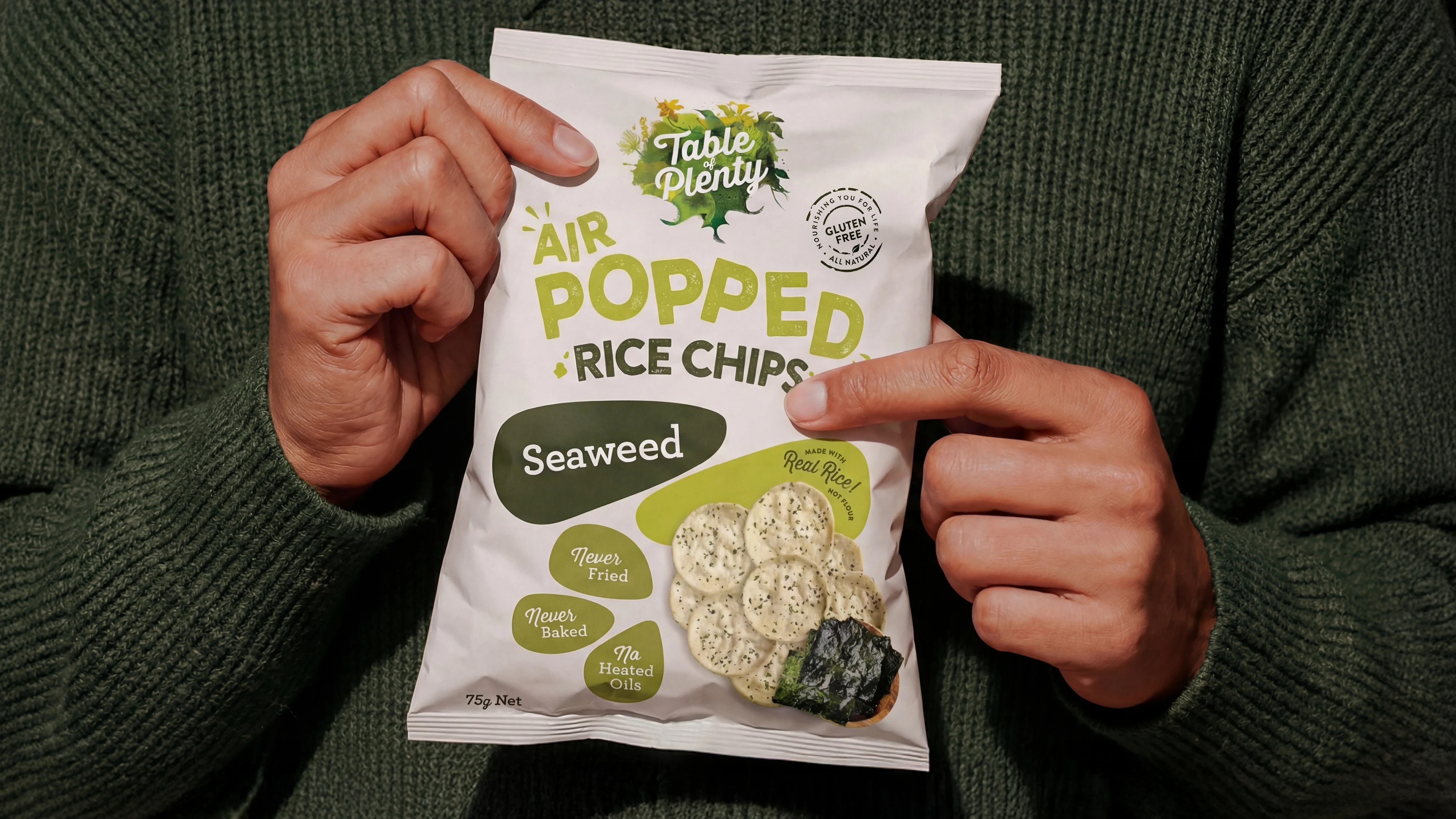
Table of Plenty is known for making healthier choices easier for Australian families, most famously through their chocolate-covered rice cakes. The opportunity was to extend that equity into a new space: a savoury rice cake range designed for people on the go who still want something healthy, satisfying and genuinely tasty.
The challenge wasn’t just “make it look good.” It was to create a range that felt unmistakably Table of Plenty, while shifting the tone from family pantry staple to modern, grab-and-go snack.
Solution
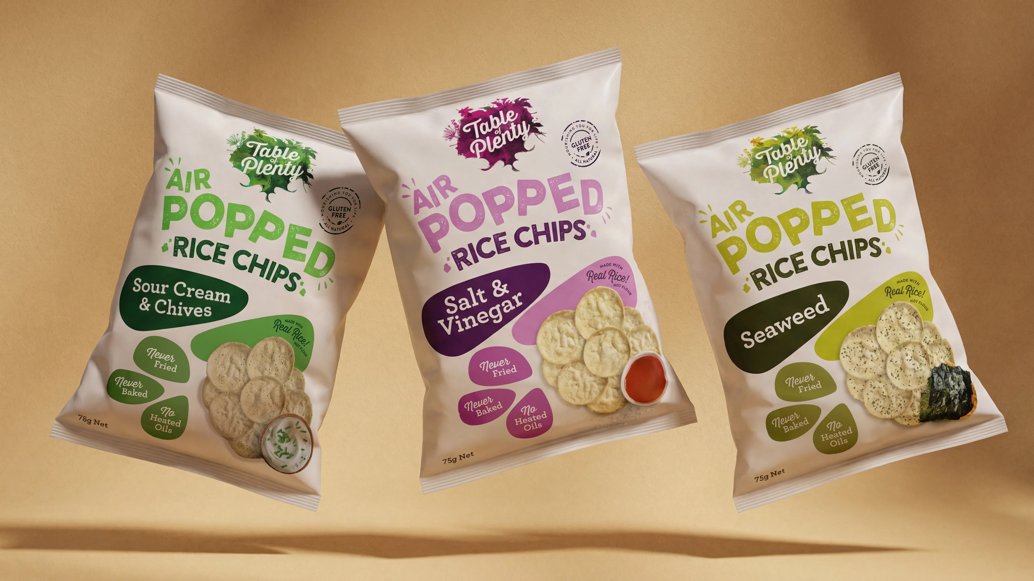
We built a packaging design system that kept the recognisable Table of Plenty foundation, then dialled up the energy and momentum to suit a more fast-paced snacking occasion.
From typography through to composition, every element was designed to have momentum, a direct visual metaphor for the air-popped process. The layouts create a sense of lightness and lift, while also guiding the eye quickly through the key information: product type, flavour and benefit.
A natural base palette maintained the brand’s healthy, ingredient-led credibility. From there, we introduced bold accent colours to differentiate flavours and inject personality, bringing a sense of life and modernity to the range without losing the brand’s grounded, family-friendly feel.
The result is a scalable packaging system that’s instantly recognisable as Table of Plenty, built to stand out, signal flavour quickly and support the brand’s expansion into a new savoury category.